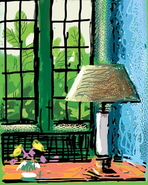
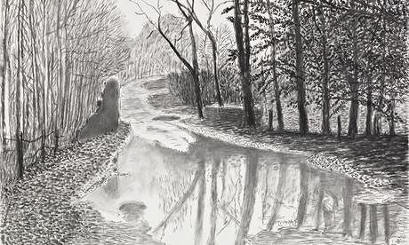
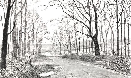
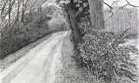
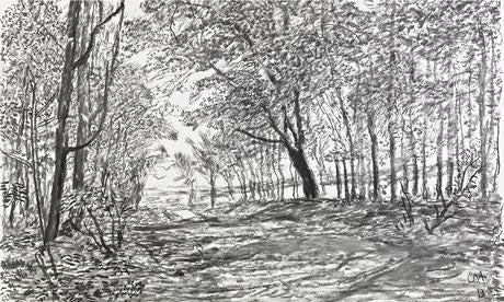
David Hockney has always been a hero of mine. I first saw his work at Salts Mill in Bradford around the age of 13. Among the overpowering scent of Lillies was an eclectic body of work ranging from the exquisitely observed and masterfully drawn, to the naively and graphically painted, via boundary pushing photo montages. Here was an artist who could seemingly do it all, who attacked every medium with creative vigour and excitement.
The thing that I fell in love with most about Hockney’s work is that once you’ve witnessed his incredible technical ability you know from that point on anything you see is exactly how he wanted you to see it. If a painting is childishly executed it’s because that’s how he wanted to convey it to you. His work is a total window into his imagination because he can realise his imagination physically. He isn’t capped by his ability. Experiencing the work at Salts Mill and my introduction to pop art at that age definitely helped form my own graphic eye and helped set the course for an interest in graphic design.
In later years as my interest in clothing and dressing has grown I’ve been inspired by another example of Hockney’s creative eye; his wardrobe. On his person Hockney wears clothes that are totally in tune with his art. In his prime his combinations of clothing were a saturated version of everyday colours and patterns. A pin stripe, but a super pinstripe. Not a soft blue but a candy pink. Normal, but the exaggerated version of it. In the 60s and 70s this approach was supercharged.
For me, his dress sense was in its prime in the eighties. He’d hit his stride. Long gone were the days of the try hard 70s, where proving your sartorial expertise and taste was to wear everything at once. No need to peacock anymore in the 80s. The glasses were still statemental and iconic, but more refined than the chunky rims that had overlapped his face in the sixties and seventies when he was developing his voice and identity. The classic British sartorial eccentricity is displayed in my favourite picture of him that leads this article – red socks and patterned slippers start the party while up top horizontal and vertical stripes put him at risk of looking like an optical illusion. The pastel blue cardigan could be one colour too many, but Hockney’s relaxed confidence puts it all at ease. An outfit that feels ‘thrown on’ by someone with a great instinct for colour and pattern. Effortless.
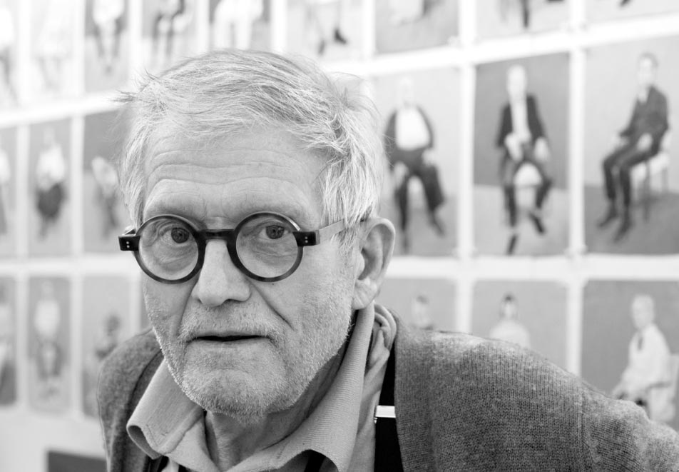
On to his later years and the harsh frames have been sacked, but my memory of them puts them on his face regardless. The power of such an iconic look. As an old man with nothing left to prove there’s little need to try too hard anymore. Echoes of his sartorial flair are present in carnation button holes and patterned braces, but there’s no time to worry himself too much about dressing when there’s so much painting to do and new techniques to embrace before his age catches up with him. Painting in fine suits has rarely looked more comfortable.
One of the reasons I like Hockney’s wardrobe and dress sense so much is that its always reflected him and where he is in his life. He dresses to suit his age and experience without ever losing his sartorial flair. It’s an outward reflection of his personality by an artist who’s always worn his imagination on his sleeve.